DPS Assignment: Mid-day Portraits

I have been meeting my goal of participating in at least 2 DPS weekly Assignments- WOOT!! It can be kinda hard to find time with the craziness of now being a business owner and still working full-time at the law firm. As much as I wanted to participate in this week's assignment- LOW ANGLE- it is a technique I use alot and feel that I challenge myself on almost every photo session I do- Simply put I LOVE the low angle perspective. 


The upcoming assignment for DPS forums is Portraits, but not just any portrait- MID-DAY PORTRAITS. Why mid-day you ask? Well, the sun is brightest at midday which can make for some extremely unflattering and washed out pictures, making assignment tougher. To top it, this assignment had a few extra rules- it had to be a mid-day portrait using at least one of 3 techniques discussed in a blog post (http://digital-photography-school.com/3-tips-for-shooting-portraits-in-bright-sunshine) :

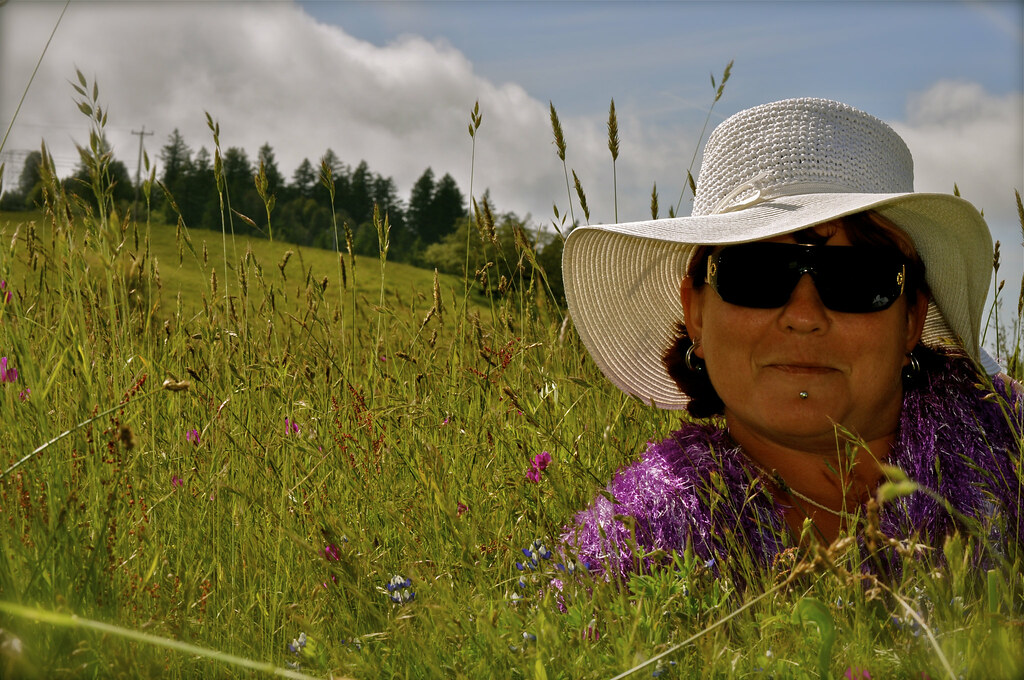
1) Find Shade- I both found shade under a tree and created shade using a large white floppy hat

2) Use a fill-flash- I used fill-flash on a few images and was pleasantly surprised- I would have never thought to use flash on a bright sunny day at 3 in the afternoon!

3) Use a reflector- I skipped this one- hey I used one more that I had too already & we were technically trespassing :)

We went up to Kneeland with my friend Buda (my pretty model) & the dog. I have been wanting to shoot in Kneeland for quite a while but never have the time or drive to make it up there. So I decided to do the portrait shoot up there thinking the scenery would be prefect & make for some awesome images- I was right!! We stopped at the schoolhouse & the adjacent field/barn for these images:

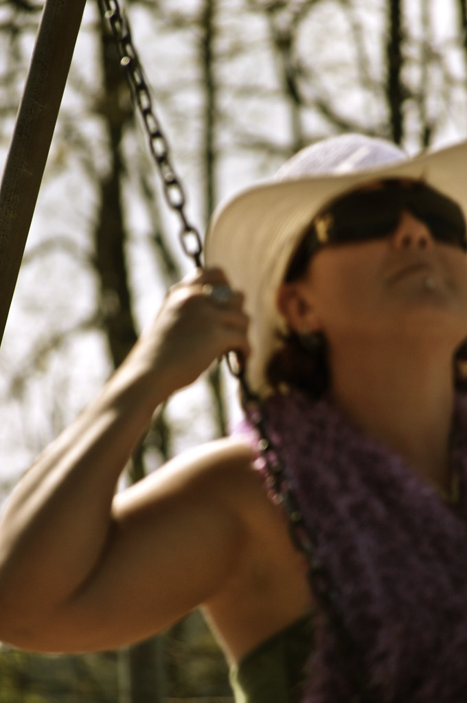
The first thing I went for @ the school- THE SWINGS!!! It has been forever since I have been on a swing & it felt great! It also felt a little dreamy, swings generally remind me of elementary school. I wanted to re-create my dreamy feeling in the image so I left the model a little blurry as if she too were dreaming. I love the way the light is hitting her, illuminating the edges & making her almost glow.


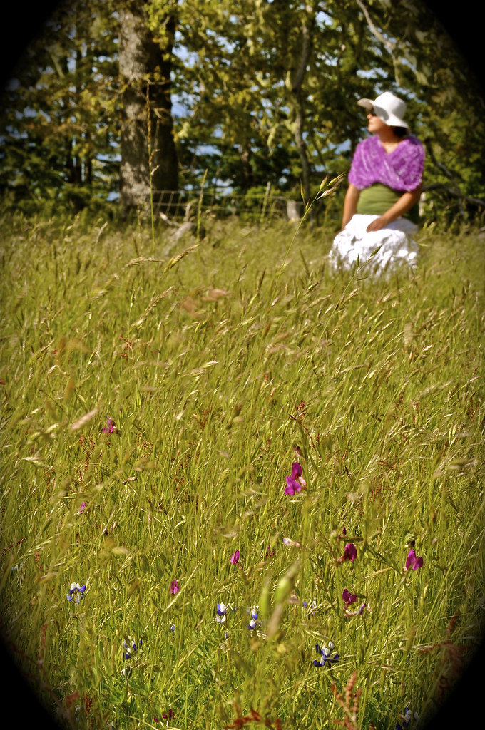
I really love this image also- I wanted to try and be more creative by keeping the subject out of focus and picking another focus area- in this case the flowers at the bottom of the frame. Practicing the whole "give your subject space to look into" thing!!


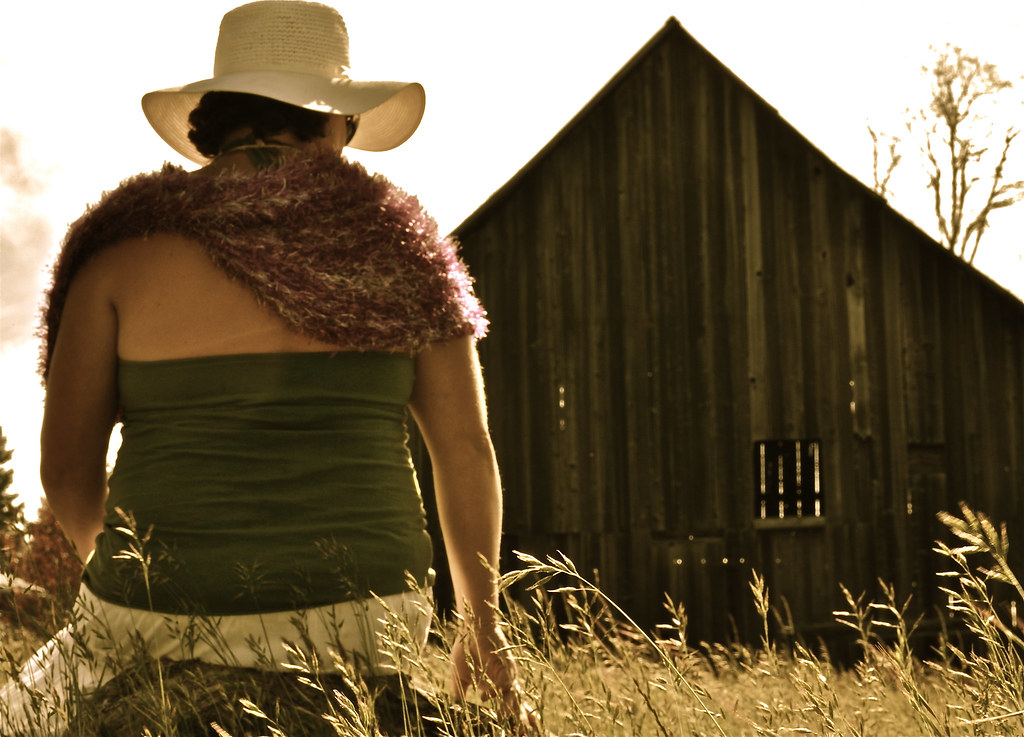
I took this image as an after-thought. I really loved the barn in front of her and the grass in the field. I processed this image quite a bit to get the right antique feel to it- I used saturation, antique effect, and highlights to make the grass stand out & look sun-kissed. 


 I was trying to vary my shots between vertical & horizontal. I post-processed this image mostly using the saturation & highlights tools. 


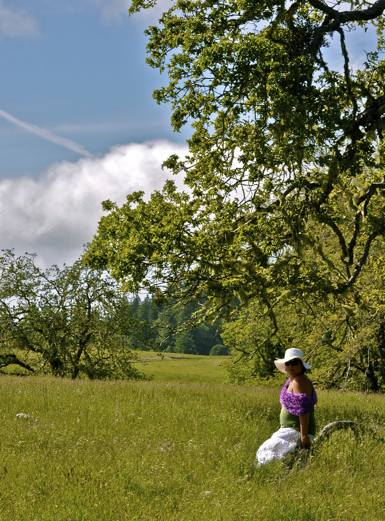
And last but not least- my entry for the assignment! No. 1 thing I learned about field portraits- be prepared to do some grass pullin! There was a ton of grass between her face & the camera I had to pull up to get a clear shot. I really love the play between the shadows created by the hat & the light of my fill-flash- It illuminated my model just enough without overexposing the rest of the image. I also was very happy with the lines created  toward the top of the image from the hat folds & the rolling hill in the background. 


This assignment made me sooo friggin nervous you can't believe! I can't image having someone pay me for portraits- what happens if they all turn out shitty? Even without any pressure from my model or for specific results it was still pretty crazy for me. I think I kept my mouth shut the entire time & didn't give Buda any directions on how to pose other than the occasional "sit there" or "lay here". Thank god she is such a great friend & model- it just came naturally to her! Next time I need to just get over the nerves & communicate- without such a great friend & sport this session could have turned out quite badly!! THANKS BUDA!!!

Location: Kneeland, CA by the Schoolhouse
Date/Time: 6/20/10 @ 3pm
Subject(s): Portraits
Notes: All images post-processed in IPhoto adjusting definition, highlights, saturation, and sharpness.

Step 2 of the Humboldt County Fair

Now that I have identified and learned from my mistakes last year, the next task to prepare for showing at the fair is to pickout my pictures and categories. I am limited to entering only 6 images total, which is probably a good idea for my sanity :). In the process of picking my images I realized that due to my comp. situation I have images scattered all over the place- my computer at home, computer at work, E's Apple, my Portable Hard Drive, and my jump drive. Whooh! So I compiled all the originals on my portable hard drive so that it would be accessible anywhere (except on the apple- boo) and so that I knew where every single original image is located. It is very important when I go to print the images that I printed from the original so that I don't get pixelated or blurry results. So I finally have all of the  images together that I want to enter, of course I have probably twice as many as I am allowed to enter. So I need some help narrowing it down to just six images. I am organizing by division/class in which each photo would be entered. Let me know which one(s) are your favorites:


Division 36 (Amateur Color) Class 10 (Flowers & Plants)

PHOTO 1: 


This image is framed at my house in the living room & I LOVE to look at it! from the fine detail on the fairs and pollen on this flower to the blurred alpine lake background, to the gorgeous light Bokeh scattered around. I just wish I could find out what this plant is!! Any ideas?


PHOTO 2:

I like the details in this photo. The veins/lines on the orchid petals, the pollen on the yellow parts of the flower, and the front blur vs. the back clarity, also the almost glowing look coming from the top pink part of the flower is awesome. It's a good image but I'm not sure if it is fair worthy. 

PHOTO 3:

This image is also okay, the only thing I LOVE about this is the rough tulip edges and the white/pink petal color blends. I feel like this image has a large empty space to the right of the tulip in focus and it seems kind of distracting to me. Perhaps this is one is a no-go. 

PHOTO 4:

I really like this photo also- mainly because of the simple nature of it. The bokeh is  very nice in the background- I would never know, if I hadn't taken it, that it was in the middle of a flowerbed in the city and not in a field of wildflowers. I also like the position of the flower in focus, coming out of the left side, leaving alot of nice open colored space around it. 

Division 36 (Amateur Color) Class 12 (Landscapes)

PHOTO 5:

I am not sure about this image. I like it overall- the positioning, angle, colors, etc. But am unsure about the bluriness/distortion around the right bottom (see gold plants) and right top (see the tree branches). I am also a little worried that when this image is printed I will end up with a empty area at the top because the sky is so blown out

PHOTO 6:

This image needs a little work before it would be entered. The same concern as before, the sky is a little blown out in the top left corner, and there is a tad distortion around the edges of the Mt's. Also the small hill in the front center is pretty dark leaving out quite a few details. 

Division 36 (Amateur Color) Class 13 (Seascapes)

PHOTO 7:

I really like this image. I have the same concerns as before- the sky is pretty blown out. But there is no distortion, the bokeh in the image is very nice, and I love the texture I was able to capture on the driftwood. I think maybe a good crop would make this image pop and get rid of that blown-out sky. 

Division 36 (Amateur Color) Class 8 (Birds)

PHOTO 8:

I LOVE this image! I think everything about it is perfect- from the colors, to the position of the birds, to the slightly but not fully blurred background. I think that I will definitely be entering this photo. 

Division 36 (Amateur Color) Class 11 (Buildings & Structures)

PHOTO 9: 

I really like this photo mainly because of the gorgeous combination of orange and blue. I think the tree in the left side of the image helps frame the building more. I wish that I had waited longer for that car to get out of the image (say it with me: Patience is a virtue!). I am not sure if the car in this picture detracts enough for me to consider not entering it. 

PHOTO 10:

This photo is good. I really like the angles and the shadows cast on the bridge interior. The view through the bridge helps lead your eye through the image. I even like the car headlights coming out of the left side helping to illuminate/shadow more parts of this image. 

PHOTO 11:

I LOVE LOVE LOVE this image! Disclaimer: I may very well be biased as it was my first long-exposure with remote trigger image. I like the small orbs around the lights but a few 3rd party viewers thought it was too much/distracting. Any ideas? This image also needs a little editing done, as it has not been edited other than cropping- I would love to bring out the stars much more!
-------------------------------------------------------------------------------------------------------------
So there it is, all 11 photos I have for the fair. Now to whittle it down to only 6!! 

TERMS: 
-Bokeh- In photographybokeh is the blur, or the aesthetic quality of the blur, in out-of-focus areas of an image, or "the way the lens renders out-of-focus points of light." Differences in aperture shape cause some lens designs to blur the image in a way that is pleasing to the eye, while others produce blurring that is unpleasant or distracting— "good" or "bad" bokeh, respectively. Bokeh occurs for parts of the scene that lie outside the depth of field. Photographers sometimes deliberately use a shallow focus technique to create images with prominent out-of-focus regions.- WIKIPEDIA http://en.wikipedia.org/wiki/Bokeh 

-Blown Out Skies- When an image is overexposed and the sky turns to pure white. This can cause issues when printing because the computer printing can interpret this space as empty and will not put any ink on that portion of the image. 

Step 1 of the Humboldt County 2010 Fair

Summer is almost here, for those of you in the south it has probably already arrived in full force :). What happens in the summer that is so special you ask? Well, aside from all the sunshine (if this rain ever lets up), summer means that annual county fair is only a few short months away!

Last year I entered 6 photos in the fair under Fine Arts-Juried-Photography- Amateur and came out with a third place win for my b&w redwood tree titled "Land of the Lost". I won a grand $2, which doesn't even cover the cost of printing and matting the winning image- go figure.  

The fair defines an amateur as someone who has won less than 5 ribbons, & does not compete or sell their images regularly.

 I didn't really win much- the experience of showing was scary as shit- but the pride I felt at seeing my images hanging on the wall and seeing that ribbon next to one of the first images I had taken when we moved up here was awesome! It was my first show/gallery/competition of any type and I was so lost in the beginning. The fair provides the artists with some rules like max. size, matting and framing guidelines, date ranges, and subjects. The rest is up to the artist to figure out. So after that first run I learned a few invaluable lessons for showing at the fair, and possibly showing just in general.  I feel much more prepared and less nervous this year- Here's hoping for my first blue ribbon!

Rule No. 1: Get your editing done early- REALLY EARLY!
 I filled out all the forms for entering the images, and then let them sit on my computer untouched for nearly a month. Before I realized it the fair was a week away and I had quite a bit of editing to do to the images before I could even get them printed, much less matted. This year I will have my images edited and sent to be printed before I even enter the paperwork!


Rule No. 2: DO NOT wait until two days before your entry is due to try and get it matted. 
You will have few if any choices of matt's (because everyone else in town got there before you) and will probably not even be able to get anyone to matt the image for you (because they are working on everyone else's). I just got lucky on that one last year. 

Rule No. 3: DO NOT just mat your images. Use a foam backing.
 If you do not use a backing and just have the image and the mat your image WILL get damaged- if not at the fair then on your way home or in storage. With all the humidity in the air your mats, without any structure, will get all warped- they are only strong paper after all. Plus, if you have a foam backing you can hang your winner on the wall as soon as you get it home instead of having to put it away. 


Rule No. 4: DO NOT under any circumstances put labels on your matt's or images. 
When I was getting ready for the fair and matting my images I thought it would look nice to put labels on the mats. These labels had basic information- my name, date taken, title of image, and division entered, with my signature. BAD IDEA! The woman taking the entries at the fair almost wouldn't take my entries because they had labels on the front. Turns out, the fair makes their own labels that they put on the image when you turn it in. Luckily the woman was a sweetheart & took the images anyway after I explained to her it was my first show and nothing said I couldn't put labels on the images so how was I to know? Labels on the back of your image is okay and even encouraged so you can pickup your images after the fair, but the front is a huge no no!

Followers