Tulip Hill

Driving from Sacramento to Eureka is quite the task. I was pretty bummed that I didn't have more time, there were soo many places I wanted to stop at take pictures of. But my honey did give in to one photo stop- I prepped him by talking about for about 2 hours before we got there so he HAD to give in! :) So we stopped at Tulip Hill Wine Tasting Room outside Clearlake, CA. We had passed the place the day before on our way to Sacramento but it was crowded beyond belief. Sunday seemed to be the day to have the place to yourself, there were only two people there! So here is my best shots out of around 20, give or take, all taken in about 20 min- Can you say super-speed-photographer?!

The obligatory entrance shot... This is only the beginning of many many many yes you guessed it- TULIPS!


I really like the dark purple fading into red contrasted with the bright yellow on this tulip. It is gorgeous the way the red looks like it is painted on the yellow- see those tiny almost brush stroke looking lines where the colors meet? 


This image is my desktop at work. I had never seen a pointy tulip before, but apparently they exist! I thought it would be hard points but they were nice and soft, just like a tulip should be. I love the general composition of this image. I took a few from some different angles and positioned the flower in different places, but this was by far my favorite. I really like the softness of the colors, and the soft focus on the background which contrasts beautifully with the harsh edges of the flower. 


These shots are only a tad bit different, and I'm not sure which I like better. The left images focus is on the background tulips, while the right images focus is on the foreground flower (Snapdragons maybe?).


One of the many gorgeous vine-covered walkways among the tulips. This place would be absolutely gorgeous for a wedding if it weren't for the long drive.  


LOCATION: Tulip Hill Winery & Tasting Room- Outside Clearlake, CA 
DATE/TIME: 3/28/10 @ 5pm 

SUBJECT: Nature, Flowers, Focus, Color
NOTES: Pictures have not been edited. 

Night-time in the City...

Me and my man took a road trip to Sacramento, CA this past weekend to go to IKEA to get some stuff for our store. I haven't been in a big city in quite some time (since October I think) so I was snappin pictures left and right. The difference in the scenery and feel of the city versus the small town I live in was amazing and inspiring (Although I love not livin there any more!). We decided to go to Old Town Sacramento for the night, because we were only there for one night and I figured it would be the best place for dinner, a nice walk, and pictures (of course!) Here are the results, enjoy!


1. Comparative Color vs. Black & White (filtered- red):

         I took these pictures seconds apart, even though they look the same. I am torn between which is my favorite. The left one is in gorgeous color, and I love the oranges and blues and the twilight sky, However, the one on the right is B&W and shows more detail, contrast, and seems more dramatic than the color picture. The B&W almost makes me think I have traveled back in time until I look at the car in the right corner.


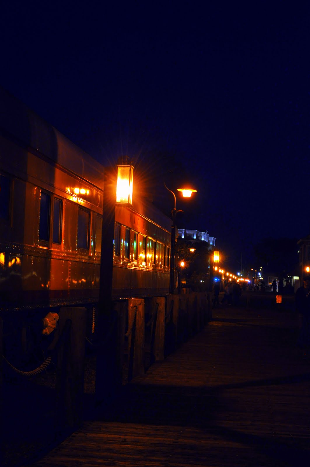
2. Train car at night:

       This photo is really dark and I wasn't even sure if it would turn out all that well b/c I left my tripod at home and have pretty shaky hands sometimes. This picture doesnt really WOW me but I like the composition of the lines of lights, and reflections on the car, as well as the more abstract almost floating lights of the skyscrapers behind it.


3. Geometric Composition:

      I snapped this image thinking that the geometric shapes set against one another might be interesting, and I think I was right. Again, I really like the orange/blue contrast between the sky and the foreground. I like that the wood looks so realistic you can see the grain and knots in it. The tree on the left makes it a little more interesting and gives the geometric angles some natural softness.


4. Comparision: Flash vs. no Flash:

      This picture is of the Bridge spanning the Sacramento River. 

The image on the left was taken without a flash. I like the drama in this picture. The dark edges and tops with the almost monochrome yellow tone of the structure (from the street lights). I really like how the lights merge together to form one long line, and how they seem to come  out of the walkway i was standing on, carrying your eye through the image.

The image on the right was taken with a flash, eliminating the yellow glow of the lamps. I got alot more detail on the cement, but that traded off with the loss of detail in the structure of the bridge itself. I like the red and stone colors but really dislike the walkway - I should have toned down the flash so it didn't reflect off the white fence so much. 

I think the left is the winner in this comparison.


5. Sacramento Bridge, Interior:

     I took this image as we were crossing the bridge. Over halfway across the bridge I looked up and thought that the interior of the bridge was very interesting so I grabbed my camera, leaned against one of the interior posts and leaned over the road (sounds pretty dangerous now) and snapped away. My favorite part of this image? The light bouncing around the interior metal structures, hiding some parts and revealing in detail other parts. I like how the top tower of the bridge fades into blackness, and even the bright lights of the car in the left corner. 


LOCATION: Old Town Sacramento, CA
DATE/TIME: 3/27/10 @ 7-11pm 

SUBJECT: Cityscapes, Buildings, Railways, Lights, Night
NOTES: Pictures have been minimally edited, most have not been edited at all. 

Dreamy Succulents

Good Morning and Happy Friday! I was browsing through some pictures on my facebook page today and came across this picture. This was one of the first few pictures I took with my new Nikon back in Jan. and I had forgotten all about it! I love these plants and I love this picture! The clear and sharp focus on the front plant is slowly blurred through the image to the top plant, which looks more soft and dreamy than the one in focus. A nice image all around, in my opinion at least!


All HAIL Friday

I was napping on the couch friday afternoon snuggled up cozy between my man and my dog when I heard the thump thump of hail outside. I nestled in a little deeper and almost disregarded the noise until it got louder and louder and I realized it had been hailing for at least 10 min... I peeked out the window and saw bright beautiful sunshine beaming down on what looked like a healthy dusting of snow. So, me being the picture fanatic I am I decided I couldnt pass up the opportunity to photographic some fresh and thick hail around my yard. None of these pictures have been edited and I was mostly trying to work on capturing the shape of the hail and the resulting water melt, mostly working with the focus of my camera. I was very pleased with the results:


I really liked this picture- the clarity at the top of the image is superb and the blurry, unfocused parts of the picture seem to almost be in theme with the water dripping down the leaf....


I used alot of Selective focusing in these images!


yet another selective focus- the rocks at the bottom almost look like they are photographed through glass, slowly coming into focus around the edge of the water and leading your eye through the left of the photo to the top. I love the fluidity of the water in this image as well as the contrast between the fully in focus rocks and the blurry unfocused rocks at the bottom.... This is actually a tiny bed of rocks next to my driveway, only about 1/2 a foot wide... Would you ever have guessed looking at this image?


This image is almost fully in focus but the bottom inch or so of the image is just ever so slightly out of focus. I really liked the V the rocks made towards the top of the image and the small yellow leaf seemed to add a nice punch of color as well as scale. I also really like being able to see the ripples in the water as well as some of the dark shadows of the rocks.  I think this looks more like a river's edge than water draining out of my driveway! :)


LOCATION: My house
DATE/TIME: March 12, 2010 @ 3pm
SUBJECT:  hail, water, rocks, plants, focus, aperture, texture

Lightbox Project: My Mini Studio

I have been so busy with everything going on, I haven't posted anything in quite a while. I now have a jewelry and print store on etsy in collaboration with a college friend- www.ScottieDesigns.etsy.com. So if you want prints of anything featured on the blog email me and I can make something happen. If you want jewelry, our prices are pretty decent and we have a variety of bracelets and earrings and offer custom goods and alterations and repairs. Ok, thats it for the advertisement!

So I built myself a lightbox last night to photograph my retail items- I am a firm believer that pictures are one of the biggest selling points of an object. Previously I had taken every item to work and photographed them in an office with a skylight. This method worked well but I really wanted a studio professional look to my items. Enter, the almighty Lightbox!

Disclaimer- this is a temporary lightbox, more of a test run if you will. I plan on making a more permanent version out of PVC in a few weeks.


I took a Costco size Raisin Bran box, cutout the sides- leaving the bottom, back, and edges. Then I taped the edges to tall pitchers to open up the front of the box, and draped a white dress lining around the outside of the box., followed with a bright desk lamp beaming down from the top... Then I found some nice looking scrapbooking paper at Michaels and taped the front to the bottom of the box, and curved it up to the top of the box with no creases. This creates a smooth borderless background- like you would find in a studio. Got out my items and props, setup the camera on the tripod, and started shooting. It took me about an hour to get 10-20 items done, I ended up with 60 pics and had 44 good useable ones- Pretty good ratio I think! Not to mention the lightbox was perfect- I didnt touch up any of the images I took, just cropped and resized. So here is what my finished product looked like:


And here are some of the shots I took- I loved using the props and  playing around with the aperture of the camera to keep the props in a small blur and keep focus on my item. I think the lighting worked really well and gave the images a real studio look- I am quite impressed with the ghetto-fabulous lightbox!


Mad River Beach

I have been so busy and away from the blog for a while.... its time to play a little catch up! I went to Mad River Beach for the first time in January, guided by my bro. (it's his favorite beach). We walked up the beach from the pot-hole ridden parking lot down to where the river meets the ocean and back to the parking lot along the biggest dunes I have ever seen! It was certainly a workout, going up and down and up and down in all that loose sand.... The day started off really cloudy and drizzly but the heavens opened up once we got to the beach, and the photography god decided the keep the clouds and rain at bay until after I had gotten a couple great shots.

This photo is towards the end of our walk, standing on top of the dunes. I love quite a few things about this picture but I guess my favorite would have to be the clouds. I love the way they draw your eye into the image, their scale and threatening, menacing look. The second thing I like is how the clouds lead your eye to the center of the image which is whited/grayed out by the fog and sea spray rolling in (and its right over that dune peak, which lines up nicely), but on either side of the center you can still see pretty far.
This photo was at the beginning of our walk. I am in love with this image, its actually my screensaver at home. From the texture of the driftwood with all the interesting turns, knobs, juts, & holes to the light and fluffy texture of the sea foam coming in so close, to the way the sea seems to disappear into whiteness... Did I mention that I am in love with this image? :)

LOCATION: Mad River Beach, McKinleyville CA
DATE/TIME: 1/30/10 , 1-3pm
SUBJECT: Nature, Landscape, Seascape
NOTES: Pictures taken using a polarizing filter and edited under 5min. mostly saturation and light levels

Hangin by the Bay

Since my car is out of service I have had alot of free time before work and during my lunch break. I decided to use this time to familiarize myself with the new camera, lenses, and filters. On this particular day I saw these seagulls by the Boardwalk while I was eating lunch. The birds eyes were locked on to the local fishing boats unloading at the dock, probably hoping for a few spilled fish. Anyway, I saw the birds and thought that it would be a good time to practice using repetition in my photo composition. I have never really tried to take photos of birds before so it was also a challenge for me to be patient with the moving, squaking, pooping mass!! I really love the way the pictures came out- they were edited very little in Picasa [mostly saturation, lighting levels, and contrast to make the colors really pop].


SUBJECT: Seagulls, Repetition
DATE/TIME: 12/30/09 @ noon
LOCATION: Humboldt Bay Boardwalk
NOTES: I used a polarizing filter on all the pictures because of the harsh noon light from the sun.

Reflections

Today I went for a walk down to the PALCO Marsh between Costco and Bayshore Mall. I have been wanting to go down there for a while but didn't really get the chance until my car was out of commission due to Volkswagon sucking ass (BTW- 04 Passat owners- beware the ignition coils/heat shield/ fuel line seal/ seat heater/ and rear taillights). Took the new camera with me and was playing around with it for these water/ reflection shots. All images have been edited with iPhoto and Picasa, with the most work being done on the left and the least on the right top image. Mainly used exposure, temperature, definition, contrast, and saturation =5min. editing time per photo.


LOCATION: PALCO Marsh (Eureka, CA)
DATE/TIME: 12/27/09 @ 3-5pm
SUBJECT: water, plants, sky, reflections

One Dog-on Good Day

Yippie! I got a new camera for Christmas!! My hunny got me a Nikon D5000 with two lenses and two filters!! So of course, I had to try out the camera as fast as humanly possible! So the first obvious subject was my dog, because she is always laying around and doesn't mind getting flashed repeatedly... It was also her birthday- we adopted her from the pound almost exactly a year ago, poor thing, spending last Christmas in doggie jail! I think she had a much better Christmas this year!

For these images I used the new camera playing around with exposure, flash settings, and shutter speed. Very small amounts of editing has been done to these photos- mainly temperature, exposure, and saturation. Also experimented with the Picasa collage feature and I like it much better than Elements!!


LOCATION: my house
DATE/TIME: 12/26/09 @ 1-9pm
SUBJECT: Scarlett, my rescued pitbull

Ornamentality

Today I planned on going to the Eureka christmas tree lighting to test out taking pictures at night with the christmas lights. However, it was freezing and dark before it even started and time was not on my side. So I did the next best thing, I set up my tripod at home by my tree and tested out a few shots playing with ISO, movement, lighting, and a few select photoshop tools (burn, dodge, saturation, levels, & layers). I took about 20 shots and picked my favorites, edited them, and then put them together in my first attempt at a photo- journalistic type collage...


-Left Top Pic- Desaturate, a touch of hue, saturation on ornament only
          I'm not sure what I think about this one- Scratch that, the more I look at it the more I dislike it but it was a good picture to practice object selection and color/b&w selections...

-Right Top Pic- Saturation, Lighting Levels, Sharpness, Highlighting edges, impressionist brush on ball
          I really like the way this pic turned out! It didnt take too long to edit it this way and I love the play of light that the edge highlighting created...


-Left Bottom Pic- Saturation, Lighting Levels, Sharpness, Blur
          I really like the glow given off by the lights both on the ball and the tree branches, The reflection of the light on the ball is wonderful. Oopsie- I forgot to turn the ball so that it would be facing the right way!


-Right Bottom Pic- Saturation, Lighting Levels, Hue
           I was playing around with movement and lights trying to create those perfect lines you see on pictures of highways at night with a long exposure.. So I varied my movements with the camera as I was pushing the shutter button (I tried moving it in a small circle, short line, long line, shaking side to side, and up and down) and found that the smallest movement is all that is needed- otherwise the ball is so out of focus and doubled that it just ends up looking like a blur... But I really liked the straight lines in this picture- it makes me think of a  falling Christmas tree- TIMBER! Would you know what this is a pic of if I didnt tell you?

TERMS: 
      Burn tool: The Burn tool is used to darken areas of an image
      Dodge tool: Used to darken areas of an imag. The Dodge tool’s name comes from the traditional photographer’s method of reducing the amount of light made available when exposing the film.
      Saturation: A measure of the strength of colour in an image.
      ISO Settings: Industry norm for sensitivity of emulsion based film, with 100 ISO being not so sensitive (and the standard ISO used by most people) to 1600 ISO which is extremely sensitive to light. In a regular non-digital camera the ISO is the type of film used.

LOCATION: My house, by the Christmas Tree
DATE/TIME: Dec. 3, 09 @ 7pm
SUBJECT: Lighting, Movement, Darkness, ISO settings, Dodge & Burn Tools,Saturation, Layers

Followers