Now that I have identified and learned from my mistakes last year, the next task to prepare for showing at the fair is to pickout my pictures and categories. I am limited to entering only 6 images total, which is probably a good idea for my sanity :). In the process of picking my images I realized that due to my comp. situation I have images scattered all over the place- my computer at home, computer at work, E's Apple, my Portable Hard Drive, and my jump drive. Whooh! So I compiled all the originals on my portable hard drive so that it would be accessible anywhere (except on the apple- boo) and so that I knew where every single original image is located. It is very important when I go to print the images that I printed from the original so that I don't get pixelated or blurry results. So I finally have all of the images together that I want to enter, of course I have probably twice as many as I am allowed to enter. So I need some help narrowing it down to just six images. I am organizing by division/class in which each photo would be entered. Let me know which one(s) are your favorites:
Division 36 (Amateur Color) Class 10 (Flowers & Plants)
PHOTO 1:
This image is framed at my house in the living room & I LOVE to look at it! from the fine detail on the fairs and pollen on this flower to the blurred alpine lake background, to the gorgeous light Bokeh scattered around. I just wish I could find out what this plant is!! Any ideas?
PHOTO 2:
I like the details in this photo. The veins/lines on the orchid petals, the pollen on the yellow parts of the flower, and the front blur vs. the back clarity, also the almost glowing look coming from the top pink part of the flower is awesome. It's a good image but I'm not sure if it is fair worthy.
PHOTO 3:
This image is also okay, the only thing I LOVE about this is the rough tulip edges and the white/pink petal color blends. I feel like this image has a large empty space to the right of the tulip in focus and it seems kind of distracting to me. Perhaps this is one is a no-go.
PHOTO 4:
I really like this photo also- mainly because of the simple nature of it. The bokeh is very nice in the background- I would never know, if I hadn't taken it, that it was in the middle of a flowerbed in the city and not in a field of wildflowers. I also like the position of the flower in focus, coming out of the left side, leaving alot of nice open colored space around it.
Division 36 (Amateur Color) Class 12 (Landscapes)
PHOTO 5:
I am not sure about this image. I like it overall- the positioning, angle, colors, etc. But am unsure about the bluriness/distortion around the right bottom (see gold plants) and right top (see the tree branches). I am also a little worried that when this image is printed I will end up with a empty area at the top because the sky is so blown out.
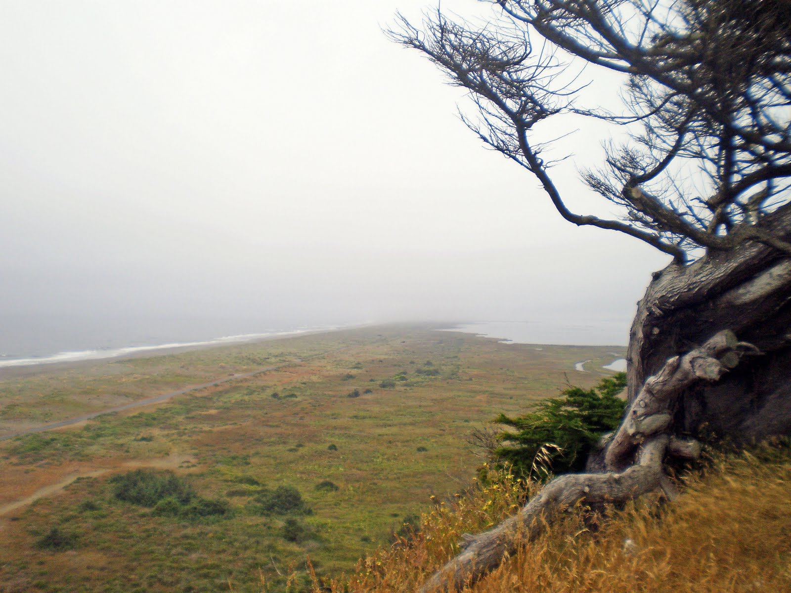
PHOTO 6:
This image needs a little work before it would be entered. The same concern as before, the sky is a little blown out in the top left corner, and there is a tad distortion around the edges of the Mt's. Also the small hill in the front center is pretty dark leaving out quite a few details.
Division 36 (Amateur Color) Class 13 (Seascapes)
PHOTO 7:
I really like this image. I have the same concerns as before- the sky is pretty blown out. But there is no distortion, the bokeh in the image is very nice, and I love the texture I was able to capture on the driftwood. I think maybe a good crop would make this image pop and get rid of that blown-out sky.
Division 36 (Amateur Color) Class 8 (Birds)
PHOTO 8:
I LOVE this image! I think everything about it is perfect- from the colors, to the position of the birds, to the slightly but not fully blurred background. I think that I will definitely be entering this photo.
Division 36 (Amateur Color) Class 11 (Buildings & Structures)
PHOTO 9:
I really like this photo mainly because of the gorgeous combination of orange and blue. I think the tree in the left side of the image helps frame the building more. I wish that I had waited longer for that car to get out of the image (say it with me: Patience is a virtue!). I am not sure if the car in this picture detracts enough for me to consider not entering it.
PHOTO 10:
This photo is good. I really like the angles and the shadows cast on the bridge interior. The view through the bridge helps lead your eye through the image. I even like the car headlights coming out of the left side helping to illuminate/shadow more parts of this image.
PHOTO 11:
I LOVE LOVE LOVE this image! Disclaimer: I may very well be biased as it was my first long-exposure with remote trigger image. I like the small orbs around the lights but a few 3rd party viewers thought it was too much/distracting. Any ideas? This image also needs a little editing done, as it has not been edited other than cropping- I would love to bring out the stars much more!
-------------------------------------------------------------------------------------------------------------
So there it is, all 11 photos I have for the fair. Now to whittle it down to only 6!!
TERMS:
-Bokeh- In photography, bokeh is the blur, or the aesthetic quality of the blur, in out-of-focus areas of an image, or "the way the lens renders out-of-focus points of light." Differences in aperture shape cause some lens designs to blur the image in a way that is pleasing to the eye, while others produce blurring that is unpleasant or distracting— "good" or "bad" bokeh, respectively. Bokeh occurs for parts of the scene that lie outside the depth of field. Photographers sometimes deliberately use a shallow focus technique to create images with prominent out-of-focus regions.- WIKIPEDIA http://en.wikipedia.org/wiki/Bokeh
-Blown Out Skies- When an image is overexposed and the sky turns to pure white. This can cause issues when printing because the computer printing can interpret this space as empty and will not put any ink on that portion of the image.


1 comments:
i don't know how you are going to choose. you are amazing at this!!! i will try to help.
Flowers: I like 2 & 3. I like the lines in the orchid one and the texture in the tulips. I also like 4 because it is simple and elegant, but many other people might enter something like this.
Landscape: I would choose the first one out of this category only because I feel that it is unique.
Buildings: I like the 2nd the best. The only suggesstion with that one is you might want to look at fixing the car headlight in the bottom left of the image only because it is distracting. I also want to suggest one that you put in your spring album on facebook - the one of the mission (?). I really liked that picture alot.
but again it is your choice and i hope you do well!! love you lots!
Post a Comment