And then there were ten- Humboldt County Fair 2011

Rock Stacks- Mad RiverRedwood Path CreekFly Away Venice CanalsBlack & White BayTopsy TurvyDiptychDevils Playground: Compartments 2
Crystal Clear Van DuzenFlowers After the Rain CloseupADDICTED- Vertical CropO Autumn Re-Edit

Humboldt County Fair 2011, a set on Flickr.

I now have 10 possible entries for the county fair in August but I can only enter 6 images- Help me!!!! I'm not sure which to keep & which to toss- Leave a comment here, on f'book, or flickr & let me know which are your favorites & not-so favorites!!

2011 Know Wonder Contest Entries

Save the Redwoods League is having their annual contest again!! I entered a few photos last year but didn't expect to win anything- So this year I'm goin big! I have almost met my limit for entries (8 outta 10 ain't bad!)- I did some pre-planning & research on which groves to shoot- & It seems they are having participation issues (out of the 200+ images submitted so far I can count less than 25 that I think even have a chance).
See the Group Pool of the entries on Flickr

I even got some surprises along the way: 1. We found an awesome new river spot; 2. Most of the grove was pretty empty; 3. I have some new fair entries from the trip (Yay! for killin two birds with one stone!)...

Rules: 
The image has to be taken within the last 2 years (no problemo!); limited editing only- ie burning, dodging, and HDR only (this was more of a challenge as I don't use those tools too often).

Judging: 
Entries are being judged in a two round system: Round 1 each judge picks 12 images (50% emotional quality & 50% Technical) Round 2 the judges picks are voted on by the public with the winner announced Aug. 25!!

MY ENTRIES
So without further ado, Below are my entries (starting with my favorites to least favorite) for the contest (keeping fingers & toes crossed for at least an honorable mention):


(I really wish they allowed gradient layers- background brightness would be easy to fix- Arggh!!)


THE GIRDLED TREE (an HDR edit)


(i'm not too happy with this one- my focus on the closest right sorrel just doesn't work)


Location: Grieg French Bell Grove outside Pepperwood, CA
Date/Time: Sunday 6/19/11 @ 11-3pm
Subject(s): Redwoods, Redwood plants, forest floor, forest canopy, paths & trails

Making a poster out of words...

I needed to create a simple poster for the store to hang up & put online so people would know we are having a sale to celebrate our 1 year anniversary. So the first place I looked for tutorials was Smashing Magazine (if you don't read this you should- its got great articles & tips for graphic designers)- & BAM there it was
60 AMAZING POSTER AND ADVERTISEMENT TUTORIALS

I just picked one I liked the look of & set off on another tutorial adventure~!

Here's the link to the tutorial I choose: CLICK HERE!
It took some messing around with fonts & font sizes for a minute since I didn't use the font in the tutorial but i never follow the tutorial 100% anyways- how boring would that be!!

And here is my final product!

I Heart Faces Fix it Friday # 99


                                 ORIGINAL                                                    MY EDIT

I recently found this great website- I Heart Faces- that offers some great tutorials and tips for photoshop as well as hosting weekly "fix-it-friday" events. Basically for fix-it-friday they let users download an un-edited image of theirs and try their hand and fixing it up in post processing. You then post a link to your edits on their website & see what others did with the same image.

 It really help keep the juices going & is a great way to get some practice in on editing portraits (not really my strong point!). My big discovery with this editing? High pass filters on eyes look amazing ONLY when the blend mode is set to color dodge (and only the colored part of the eye is selected). 

HOW I DID IT:
- Opened in Camera RAW & added Strong S Curve- opened in Photoshop
-LAYER 1:  Background Copy- used smudge tool to soften hair and skin blemishes (w layer mask over skin fixes)
- LAYER 2: Background Copy of Layer 1- disabled layer mask over skin fixes, adjusted opacity to 68% & fill to 57%
- LAYER 3: Background Copy- blur filter applied to gray background only
- LAYER 4: layer via copy (only eyes selected)- high pass filter, blend mode color dodge, added brightness/contrast adjustment layer (32 Brightness, 27 Contrast)
- LAYER 5: color fill layer (orange/sepia tone), blend mode overlay, adjusted opacity to 43%
- LAYER 6: applied red photo filter at 35% density, then layer mask to show only red areas of image (candy & shirt)
- LAYER 7: The Pioneer Woman action Quick Edge Burn, blend mode linear burn, at 65% opacity

Creative Self-Portraits

I am thinking about trying out some self-portraits lately. I recently read an article about how practicing with self-portraits can help increase both your portrait knowledge and confidence so I figured I'd give it a go...

I just wanted to make a quick post with some creative and inspiring self-portraits to help get my juices goin!

- Multiple Exposure (showing a domestic action, showing pole positioning, self interacting with self, etc.)

/\ /\ Axisgrind has disabled their photo downloading so it's just a link - but it is an amazing photo!


- Reflections (mirrors, building glass, items that mean something special to me, opposite mirror personalities, etc.)


/\ /\ I used to have a really old pic of myself putting on makeup as well & I loved it! Unfortunately I think it was on my laptop which was stolen a few years back =( Time for a new one!!


- Get Dirty! (paint, dirt, smeared makeup, etc...)


- Light Painting (using x-mas lights, flaslights, glowsticks- shapes, words, and highlighting objects or body parts)

- Body Part focusing (specific parts only- legs, feet, eyes, hands, back)


- Favorite activites as props (books, photography, etc.)


Techniques/ Things to try not pictured: 
- Skin overlay (tattoos, textures, colors, cracking, peeling, words, etc.)
- Artsy Fartsy (partial nudes, selective coloring, natural light portrait)
- Diptych/Triptych
- Jumping/ Floating

It's Summatime!!!

"Well the summers here and the time is right -- for _________ (insert favorite summer activity here)"

Rock Stacks- Mad River by Becky Simmons

I had such a good time relaxing at the Mad River this past Sunday. It was a wonderful day for our first river trip of the year- a bit chilly for swimming but I really needed to beef up my base tan anyway. I love playing with the rocks at the river - there are so many & they are all so different- so I made a few rock stacks next to my inner tube (btw, much harder said then done thanks to all my ripples) - and proceeded to snap some right before the sun's glorious warmth left us behind the tree line... 

Edits: Strong S cuve; 8x10 crop; minor vibrance & clarity; layered with two images- hand aligned (one of back rocks in focus, other of front rocks in focus) with layer mask to reveal the in-focus points of the back image (the farthest rocks); The Pioneer Woman action seventies @ 60% opacity...

Using Gradient on blown out skies

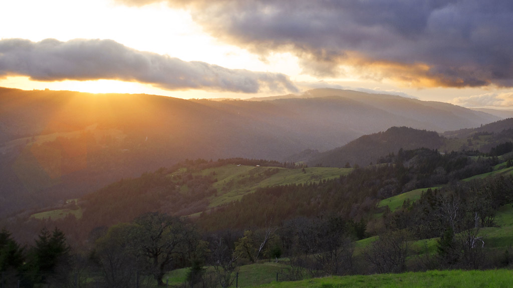
        I was on my way out to Willow Creek last weekend when I noticed this absolutely stunning sunset as we were coming over the mountains. We were in a hurry but a sunset like that is impossible to pass by without at least stopping for a second... I took a few pics but nothing serious as I really just wanted to capture the beauty & not take too long (it was getting chilly yo!!) I kicked myself in the ass when I got home & looked at the pics b/c every single image had hugely blown out skies but the grounds was dark as all get out- like this one:


ORIGINAL- SOOC

original hwy 299

         So I opened handy dandy photoshop & went to work trying to bring up the light on the ground, & fixing the blown out areas while also making the clouds pop. Mainly I used the brightness/contrast adjustment layer, but found that while it made the clouds pop it made the blown out areas 10x worse:


FIRST EDIT- not too happy with the sky/clouds area, not enough pop but very blown out...
Adjusted levels on the sky/clouds only; Selective Coloring on entire image- yellows, reds, & greens; Added hexagon layers (@ 12% Opacity) in pink, orange & green (getting smaller as they go) to imitate lens flare... 

HWY 299


        I still wasn't super happy with the way it turned out so I did what every flickr lovr does & posted the original and edited image in a group "Photography Critique" and got some great feedback from one user recommending I use a gradient layer- get this- with DETAILED instructions!! Thank God!!! 
I have been so scared to use the gradient tool- I think because whenever I pull it up all I see is crazy colors... But I gave it a try & love the new image:


SECOND EDIT- Love it!! adjusting the blown out sky while making clouds pop with Gradient layer
Adjusted Levels of sky/clouds only; Selective Color over entire image adjusting the reds, yellows and greens; Hexagon layers in pink, orange & green (getting smaller closer to viewer) to imitate lens flare; Gradient Fill Layer set to linear, black & reversed, med. opacity (used a layer mask to reveal the mountains that the gradient layer was over and keep them bright)...

HWY 299 Gradient


     Which edit is your favorite & why? Or is something you would have done differently to this image? Feel free to download and edit- show me what you can do!!


Location: Vista Point off HWY 299 between Blue Lake & Willow Creek, CA
Date/Time: Wed. 4/27/11 @ 7:30pm
Subject(s): Sunset, Rolling Hills, Clouds, Sun rays
Notes: used polarizing filter & edited in photoshop

Tutorial- Using Textures, Layer Masks, & Cropping

I was out on my lunch break the other day taking photos of textures to use in photoshop and in graphic design. I need to start working on a website for the store so the more textures and backgrounds I have to choose from the better!  Anywhoo.. I stopped at some blooming cherry trees for a few minutes. I took some cherry blossom photos last year but I wasn't too happy with ow they turned out so I was excited to give it another go... And pleased with the results of my 5 minutes...


OVERLAY USED:


It's My History Kit (came with my old ps elements disc) Olive Fleur De Lis


<-----------
ORIGINAL
mildly edited- Strong SCurve & Contrast & Clarity...


----------->
 STEP 2
cloned out the weird wrinkly raisin looking thing in the upper right of the blossom


<-----------
STEP 3
green fleur de lis paper overlay (as a new layer on top) with low opacity

----------->
STEP 4
layer mask (use the paintbrush tool- black to hide, white to reveal) painted over the flowers to keep them clear of the overlay (feathered)


DIFFERENT CROPS
I wanted to try a few different crops to see what fit this image the best. I'm trying to get a better understanding of how subject matter relates to the crop selection so this was kind of a neat quick exercise to see how it played out...


4:3 Crop -- for Windows Screensavers


16:9 Crop, for HD Screens


1:1 Crop, Square Size


2:3 Crop, Traditional 4x6 Print

2.5:5 Crop, 5x10 Print


AND.... I am having a hard time choosing between the 16:9 HD crop and the 5x10 crop....

I need an external hard drive for all this STUFF!!!


Location: 7th & I -- Eureka, CA
Date/Time: April 14, 2011
Subject(s): Cherry Blossom
Notes:

Followers