
Night-time in the City...
Me and my man took a road trip to Sacramento, CA this past weekend to go to IKEA to get some stuff for our store. I haven't been in a big city in quite some time (since October I think) so I was snappin pictures left and right. The difference in the scenery and feel of the city versus the small town I live in was amazing and inspiring (Although I love not livin there any more!). We decided to go to Old Town Sacramento for the night, because we were only there for one night and I figured it would be the best place for dinner, a nice walk, and pictures (of course!) Here are the results, enjoy!
1. Comparative Color vs. Black & White (filtered- red):
I took these pictures seconds apart, even though they look the same. I am torn between which is my favorite. The left one is in gorgeous color, and I love the oranges and blues and the twilight sky, However, the one on the right is B&W and shows more detail, contrast, and seems more dramatic than the color picture. The B&W almost makes me think I have traveled back in time until I look at the car in the right corner.


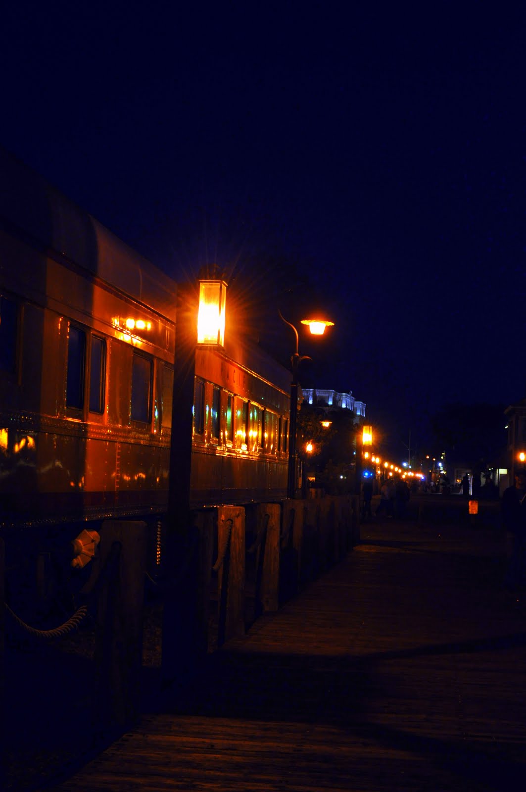
2. Train car at night:
This photo is really dark and I wasn't even sure if it would turn out all that well b/c I left my tripod at home and have pretty shaky hands sometimes. This picture doesnt really WOW me but I like the composition of the lines of lights, and reflections on the car, as well as the more abstract almost floating lights of the skyscrapers behind it.
3. Geometric Composition:
I snapped this image thinking that the geometric shapes set against one another might be interesting, and I think I was right. Again, I really like the orange/blue contrast between the sky and the foreground. I like that the wood looks so realistic you can see the grain and knots in it. The tree on the left makes it a little more interesting and gives the geometric angles some natural softness.

4. Comparision: Flash vs. no Flash:
This picture is of the Bridge spanning the Sacramento River.
The image on the left was taken without a flash. I like the drama in this picture. The dark edges and tops with the almost monochrome yellow tone of the structure (from the street lights). I really like how the lights merge together to form one long line, and how they seem to come out of the walkway i was standing on, carrying your eye through the image.
The image on the right was taken with a flash, eliminating the yellow glow of the lamps. I got alot more detail on the cement, but that traded off with the loss of detail in the structure of the bridge itself. I like the red and stone colors but really dislike the walkway - I should have toned down the flash so it didn't reflect off the white fence so much.
I think the left is the winner in this comparison.


5. Sacramento Bridge, Interior:
I took this image as we were crossing the bridge. Over halfway across the bridge I looked up and thought that the interior of the bridge was very interesting so I grabbed my camera, leaned against one of the interior posts and leaned over the road (sounds pretty dangerous now) and snapped away. My favorite part of this image? The light bouncing around the interior metal structures, hiding some parts and revealing in detail other parts. I like how the top tower of the bridge fades into blackness, and even the bright lights of the car in the left corner.

LOCATION: Old Town Sacramento, CA
DATE/TIME: 3/27/10 @ 7-11pm
SUBJECT: Cityscapes, Buildings, Railways, Lights, Night
DATE/TIME: 3/27/10 @ 7-11pm
SUBJECT: Cityscapes, Buildings, Railways, Lights, Night
NOTES: Pictures have been minimally edited, most have not been edited at all.


0 comments:
Post a Comment